What Is A Candlestick Chart?
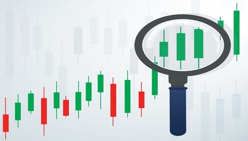
The majority of active traders now use candlestick charts as their primary charting tool. Candlestick charts, as opposed to line or bar charts, provide you fast access to five data points (open, high, low, close, and change), which you may use to rapidly evaluate market sentiment. You may also discern shifts in market mood by looking at combinations of candlesticks, which might lead to trading opportunities if you pay attention to them. To increase their chances of being successful, all traders should have a solid grasp of the information included in these charts.
What is a candlestick chart?
A candlestick chart is a type of financial chart that graphically represents the price moves of an asset for a given timeframe. The name gives away the fact that it is constructed from of candlesticks, each of which stands for the same length of time as the others. The candlesticks are versatile and may be used to symbolize almost any time period, from seconds to years.
The first known use of candlestick charts was probably in the 17th century. It is often believed that a Japanese rice merchant named Homma was the first person to use them as a charting tool. It is quite possible that his concepts formed the basis for what is now known as the contemporary candlestick chart. The discoveries of Homma were then developed further by a number of people, most notably Charles Dow, who is considered to be one of the pioneers of contemporary technical analysis.
Although candlestick charts might be used to the examination of any other kind of data, the primary purpose for which they are utilized is to simplify the process of analyzing financial markets. When used properly, they are instruments that may assist traders in estimating the likelihood of certain outcomes in the movement of the price. They may be valuable because they allow traders and investors to build their own ideas based on their study of the market, which is based on the trader’s or investor’s own understanding of the market.
How do candlestick charts work?
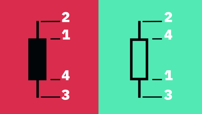
The following price points are needed to create each candlestick:
- Open — The first recorded trading price of the asset within that particular timeframe.
- High — The highest recorded trading price of the asset within that particular timeframe.
- Low — The lowest recorded trading price of the asset within that particular timeframe.
- Close — The last recorded trading price of the asset within that particular timeframe.
This collection of data is often referred to as the OHLC values when it is discussed as a whole. The appearance of the candlestick is determined by the connection between the open, high, and low points as well as the close.
The space that extends from the open to the close is referred to as the body, while the space that extends from the body to the high and low points is called the wick or the shadow. The span of the candle’s motion from its highest point to its lowest point is referred to as the range of the candlestick.
How to read candlestick charts
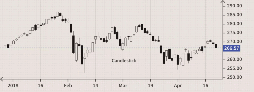
Even though bar and line charts and candlestick charts both display the same information, many traders believe that candlestick charts are simpler and easier to understand than bar and line charts. Charts that use candlesticks are easy to read at a glance and provide a straightforward illustration of price movement.
In actual trading, a candlestick represents the conflict that takes place between bulls and bears over a certain time period. In general, the greater the length of the body, the greater the intensity of the purchasing or selling pressure that occurred within the interval that was being assessed. If the wicks on the candle are short, this indicates that the high (or low) price during the recorded period was quite close to the price at which the candle closed.
If the body of the chart is colored green, this indicates that the value of the asset increased after it opened and closed for the day. The color and the settings may be different for each charting tool, but in general, this is the case. The color red indicates that the price fell down throughout the interval that was being monitored, and as a result, the close was lower than the open.
Some chartists like using black-and-white representations rather than color ones. Therefore, instead of using green and red, the charts use hollow candles to show upward movements and black candles to symbolize downward movements.
What candlestick charts don’t tell you
Candlestick charts are helpful in that they may offer you with a general understanding of how prices move, but it’s possible that they won’t provide you all the information a full study requires. For instance, candlesticks don’t depict in great detail what occurred during the time period between the open and the close; all they show is the distance that separates the two points (along with the highest and lowest prices).
In the case of a candlestick, for instance, the wicks can tell us both the high and the low of the time, but they are unable to tell us which one came first. Nevertheless, the timeframe may be altered in the majority of charting systems, enabling traders to zoom into lower periods in order to get additional insights.
Candlestick charts may also include a lot of market noise, particularly when tracking lower periods. This is especially true when candlestick charts are used. The candles are prone to making rapid changes, which may make it difficult to decipher what they are trying to communicate.
Heikin-Ashi candlesticks
Up until this point, we have gone through what is frequently known as the Japanese candlestick chart. However, there are other more methods to compute candlesticks. One of these methods is known as the Heikin-Ashi Technique.
Heikin-Ashi means for “average bar” in Japanese. These candlestick charts are derived using a modified method that takes into account the average price. The primary objective is to eliminate noise in the market while simultaneously smoothing out price behavior. As a result, using Heikin-Ashi candles may make it simpler to recognize market trends, price patterns, and potential reversals in direction.
Traders often combine Japanese candlesticks with Heikin-Ashi candles in order to reduce the number of erroneous signals they get and to boost the likelihood of correctly identifying market movements. When it comes to the Heikin-Ashi candlestick chart, a strong uptrend is often shown by green candles with no lower wicks, whilst a strong decline may be indicated by red candles with no upper wicks.
Although Heikin-Ashi candlesticks have the potential to be a useful tool, just like any other kind of technical analysis, they are not without their restrictions. Because these candles utilize the weighted average of previous prices, it may take longer for patterns to emerge. In addition, they do not reveal any price gaps and may conceal the visibility of other pricing data.
The Heikin-Ashi Formula
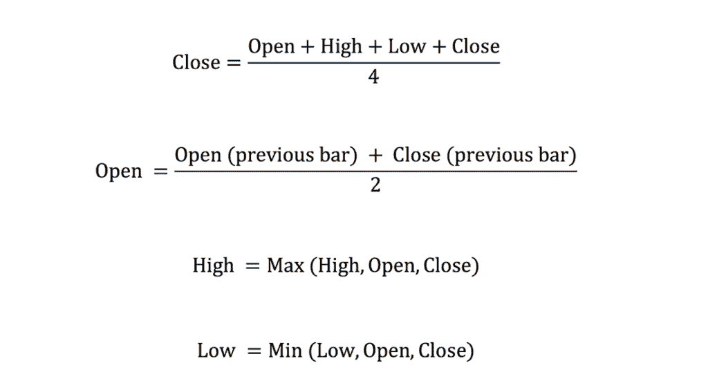
Standard candlestick charts are made up of a number of open, high, and low close (OHLC) candles that are spaced out throughout the course of a time series. Standard candlestick charts have certain traits with the Heikin-Ashi method, however the Heikin-Ashi method employs a modified version of the close-open-high-low formula (COHL):
Constructing the Chart
The construction of the Heikin-Ashi chart is similar to that of a standard candlestick chart; however, the formula that is used to determine the value of each bar is modified, as can be seen in the preceding section. The user choose what kind of chart they want, such as daily, hourly, or five-minute intervals, and then defines the time series that corresponds to that chart. The good days are symbolized by candles that are empty, while the down days are represented by candles that are filled with wax. These may also be filled in by the chart platform; for example, up days would be represented by the color white or green, while down days would be represented by the color red or black.
The charts that are shown above illustrate the many distinctions that can be made between the two kinds of charts, which are important to keep in mind. Because it is basically taking an average of the movement, Heikin-Ashi seems to have a smoother overall appearance. While using Heikin-Ashi, the candles have a propensity to maintain their red color during a downward trend and maintain their green color during an upward trend. In contrast, standard candlesticks tend to alternate color even when the price is going mostly in one direction.
Notable as well is the pricing structure. The current price that is shown on a regular candlestick chart will also represent the current price of the asset, and this price will match the price at which the candlestick closed (or the price at which it is still trading if the bar hasn’t yet closed). Due to the fact that Heikin-Ashi takes an average, the price that is now shown on the candle could not correspond to the price at which the market is presently trading. Because of this, the Y-axis of many charting systems displays not one but two prices: the first is used for the computation of the Heiken-Ashi, and the second represents the current price of the asset.
Closing thoughts
Charts with candlesticks are one of the most essential tools for every trader or investor to have. Not only do they provide a visual depiction of the price activity for a particular asset, but they also enable the flexibility to evaluate data in a variety of periods.
A thorough understanding of candlestick charts and patterns, together with an analytical mentality, sufficient experience, and sufficient time spent trading, may ultimately offer traders with an advantage over the market. However, the vast majority of traders and investors are in agreement that it is necessary to take into account other approaches as well, such as fundamental analysis.

